Global rebrands
to one-off editions.
Our determination to deliver above and beyond for our client partners is universal irrespective of scale or profile.
view project
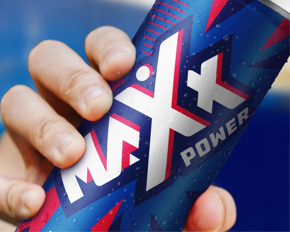
Maxx Power
A catalyst for life.
view project

Biscoff
Celebrating a deliciously iconic cookie.
view project
Atria
Fresh meat for a market leader.
view project
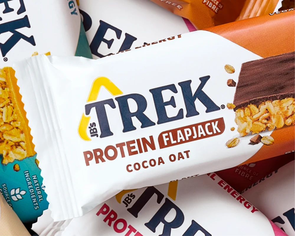
TREK
Energising a well-loved protein snack.
view project
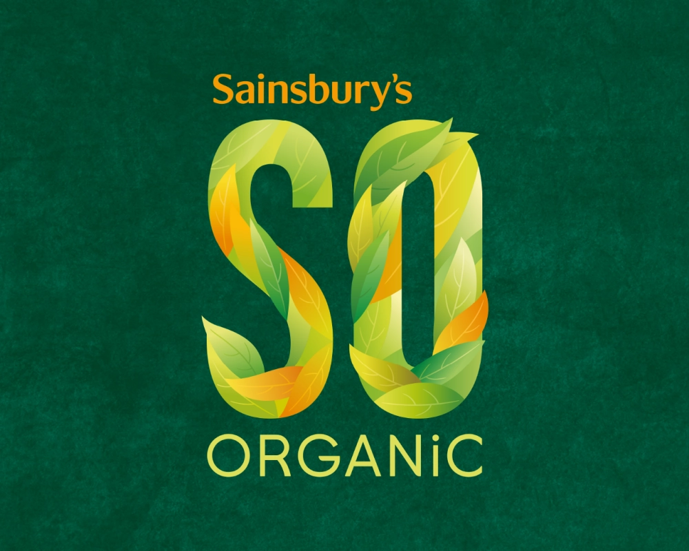
SO Organic
In harmony with nature.
view project
Acron Aviation
A breath of fresh air in the aviation industry.
view project

Taste the Difference
See the difference, evolving a £1bn brand.
view project
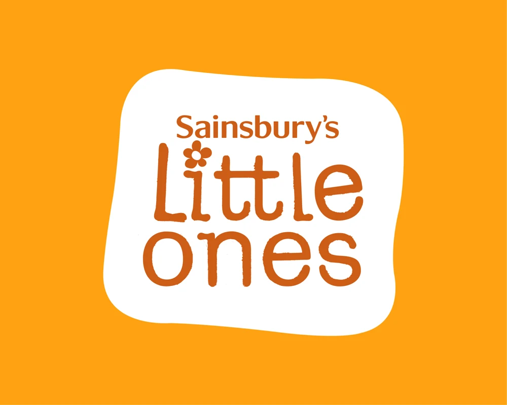
Little Ones
Big smiles for parents of little ones.
view project

New Originals
A new path for New Originals.
view project

Aito
Bringing the leading Nordic oat drink in from the cold.
view project
Almarai
Taking a scoop of the ice cream market.
view project

Serra Da Estrela
A living identity for a living ecosystem.
view project

nākd.
Bare-faced brilliance.
view project
Finn Crisp
A strong Finnish for new traditional.
view project
Terry's
More contemporary all round.
view project

Vida
Vibrant, vital, versatile, vivid, Vida.
view project

Sumol
Full of passion, full of flavour.
view project
Lucozade
From Lara to Love Island, a legacy of limited editions.
view project
Limaz
A new frozen brand to stand the heat.
view project

Kronenbourg
Limited edition goals.
view project

Birds Eye
Hitting the mark for frozen foods.
view project
Thompson's
A cuppa over a decade in the making.