A breath of fresh air in the aviation industry.
Acron Aviation
Commercial Aviation Solutions was ready to fly
Under new ownership, Commercial Aviation Solutions needed to reinvent itself with a credible new brand identity, built from the ground up, that would facilitate growth as an independent business. The new identity needed to engage with consumers, both b2b and b2c, while consolidating the business’s four commercial units under the same banner. The ambition of the brand creation was to shake off their cold and corporate past, and build a warm, approachable and trusted brand in its place.
Naming
Brand creation
Brand guidelines
Social media
Motion
Signage
Liveries
Acron Aviation is at the forefront of technological innovation, using data-led insight to shape the future of flight. They needed an identity that not only positioned them as the thought leader that they are, but as an approachable partner ready to demystify their world.
Chris Cole
Design Director, BrandMe


Insight.
Going above the rest.
Our goal was to create a brand that was designed for approachability – shedding the corporate history of the company, and the coldness of the wider aviation industry. We knew from research that the brand was top tier in their services and products, but also more agile than their competitors, so our creative work needed to reflect that. Our first task was to change the brand’s name to one that’s global, distinct and immediate. Acron Aviation is a trusted partner, forming long-term relationships with clients and inspiring the next generation of aviators, through warmth and reassurance.


Approach.
An identity that would go further.
We built a new positioning based on stakeholder insights, meaning the brand’s values and personality were at the core of the design process. Then, we created a bespoke identity, expressed through a contemporary logo and supporting guidance to successfully implement the brand.
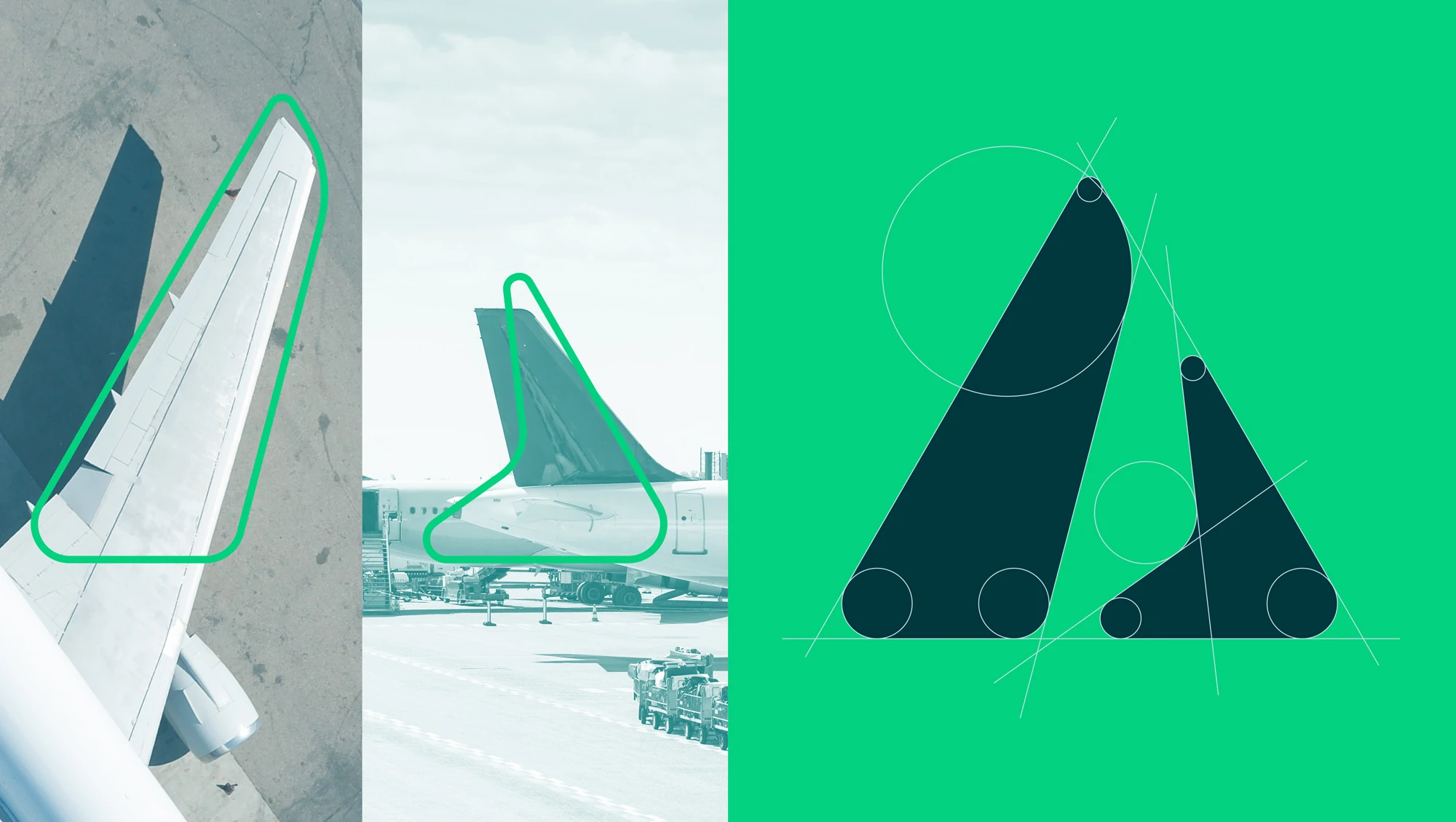
In an industry characterised by hard lines and cold blue palettes, we set about to disrupt with generous curves and a vibrant green colour story. Signifying renewal and vitality, the green palette grounds the brand as a future-facing innovator. The icon takes those established, recognisable shapes from within aviation and evolves them into a positive and immediate signifier for the brand.
With touchpoints ranging from an aircraft’s tail to the epaulettes on a pilot’s uniform, Acron’s brand identity needed to be adaptable and flexible.

Realisation.
We created a comprehensive set of brand guidelines to inform how the brand would behave across a host of touchpoints, globally, so that wherever the brand was, its values and personality were there to welcome and support their consumers.


Bringing a brand to life isn't just about design – it's about seamless integration into every touchpoint. Collaborating with BrandMe on the creation of our new brand was an exciting journey of transformation. Together, we crafted a brand identity that wasn't just visually striking but also adaptable across countless applications. Their expertise in guiding the brand’s realisation ensured that every element, from guidelines to execution, worked cohesively across platforms, bringing the brand to life in a way that was both consistent and dynamic.
Oliver O'Kavanagh
Head of Creative Services, Acron Aviation

