Celebrating a deliciously iconic cookie.
Biscoff
A brand with more bite
In recent years, the iconic Lotus Biscoff cookie has exploded in popularity, drawing fans from all over the world. With its rich heritage, brand story and unique Belgian recipe since 1932, the brand already owned many equities.
The team at Lotus Bakeries came to us to help them develop a stronger, more unified and distinctive brand identity.
There were two main challenges to the brief. Firstly, the brand needed to drive global recognition and smoothly transition to one consistent brand, where previously there were different visual expressions across markets. This required synergy without disrupting recognition for existing consumers. Secondly, the brief called for better communication of the brand’s joyous, uplifting and approachable personality, which needed to be brought to life.
Brand redesign
Packaging
Global brand guidelines
Packaging guidelines
Seasonal limited edition
Brand strategy

The new identity brings to life Biscoff’s bold, joyful personality in a contemporary way and continues to communicate the brand’s delicious taste experience. There is a sense of warmth and inclusivity in this confident new brand mark. Positive, friendly and always approachable.
Charlotte Elder
Creative Director, BrandMe


Insight.
Clarity through simplicity.
With the need for synergy at the heart of the brief, our strategic insight led us to develop a simple and ownable visual language for the brand.
This included redefining how the brand is represented digitally – optimising for social media and futureproofing the brand expression.
This included redefining how the brand is represented digitally – optimising for social media and futureproofing the brand expression.


Approach.
Thinking far and wide.
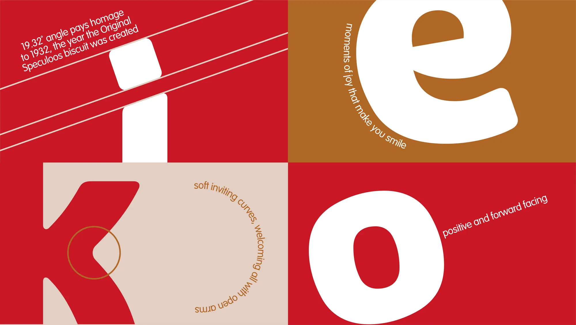
We created a bold new visual identity that puts the emphasis heavily on the Biscoff name, building more standout and ensuring a consistent global brand presentation. The form of the wordmark creates a semiotic smile that reinforces the brand’s joyous positivity. The logo pays homage to the original cookie in the tittle of the ‘i’, allowing the iconic Lotus cookie to appear on every brand touchpoint.
We crafted a bespoke brand typeface to build personality and charm, while ensuring more visual consistency. The chunky letters utilise the high contrast red and white of the brand to ensure a strong presence, while the generous curves help drive Biscoff’s friendly and approachable personality.
In addition to the visual identity, we refreshed the packaging for the full product portfolio, including seasonal limited editions.

Realisation.
To ensure that the brand vision was fully realised on a global scale and across all markets, we created a comprehensive set of brand guidelines, detailing both the visual language of the brand and technical packaging specifications.
The brand now has a modern foundation from which it can continue to build and capitalise upon its popularity, expanding into new categories and exploring new innovations to excite its consumers.
The brand now has a modern foundation from which it can continue to build and capitalise upon its popularity, expanding into new categories and exploring new innovations to excite its consumers.


