Bare-faced brilliance.
nākd.
nākd. are revolutionaries
Back in 2006, their raw snack bars, made using only fruit and nuts, took the market by storm, but they needed a brand redesign that would celebrate their unique approach to flavour for a new generation of snackers across the globe.
We collaborated with the nākd. team to craft the packaging design – strengthening and evolving what people thought of the brand.
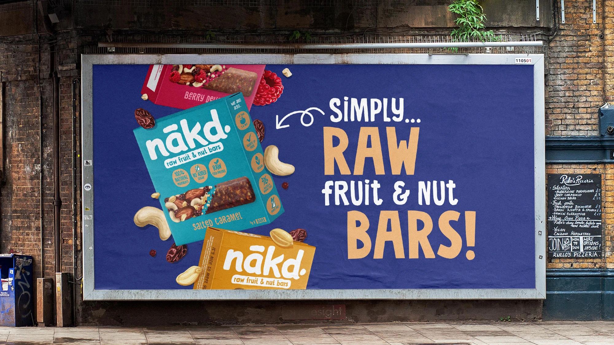
The aim? To balance communicating nākd.’s pure, unprocessed products and exciting tastes, while increasing recognition of the iconic identity.
We collaborated with the nākd. team to craft the packaging design – strengthening and evolving what people thought of the brand.
The aim? To balance communicating nākd.’s pure, unprocessed products and exciting tastes, while increasing recognition of the iconic identity.
Brand redesign
Portfolio strategy
Innovation
Packaging
Point of sale

The healthy snacking category has rapidly expanded over the last few years, and is full of exciting challenger brands. We needed to re-establish nākd. as a pioneer, through a strong, ownable and disrupting visual style, clear range navigation and strong communication of what makes nākd. unique.
Adam Wilford
Creative Director, BrandMe


Insight.
A unique recipe of creativity and consistency.
Our key challenge? To communicate the product’s authentic taste appeal and texture to consumers across markets all over the world on pack. We needed to create a distinct visual style, that would drive taste and be ownable to the brand. We knew hierarchy would be key, because then we could hero the brand, product, and health benefits in a neat way that’s easy to navigate.


Approach.
A unique recipe of creativity and consistency.
We refreshed the brand logo making it more bold and iconic, and introduced a new illustration style for the brand that brought nākd.’s natural ingredients to life in all their glory. This style is now a recognisable asset that nākd. can use across touchpoints and communication platforms.

Realisation.
We created a practical, easy-to-use design system that could be rolled out across markets and languages. Combined with an off-pack visual style that created consistency across all media, our system was then seamlessly applied as new ranges were added to the nākd. portfolio.


