Energising a well-loved protein snack.
TREK
With consumers becoming increasingly health-conscious and the protein category bulking up fast, TREK needed a new design to take them the extra mile. Building on their new brand positioning of ‘natural energy for all’, our challenge was to increase brand awareness, support clear navigation across the portfolio and drive purchase to expand the brand globally.
Brand strategy
Brand redesign
Packaging
Brand communications
Brand guidelines
We are thrilled with the incredible work BrandMe has done in refreshing the TREK Protein brand. Their creativity and dedication have truly brought our vision to life, delivering a bold and dynamic design that perfectly captures our commitment to natural energy. Working with BrandMe has been a pleasure, and their expertise in creating a strong, impactful visual identity has set the stage for our future growth. We look forward to continuing our partnership and seeing TREK succeed in the global market.
Salome Altwegg
TREK Global Brand Team
Strategy.
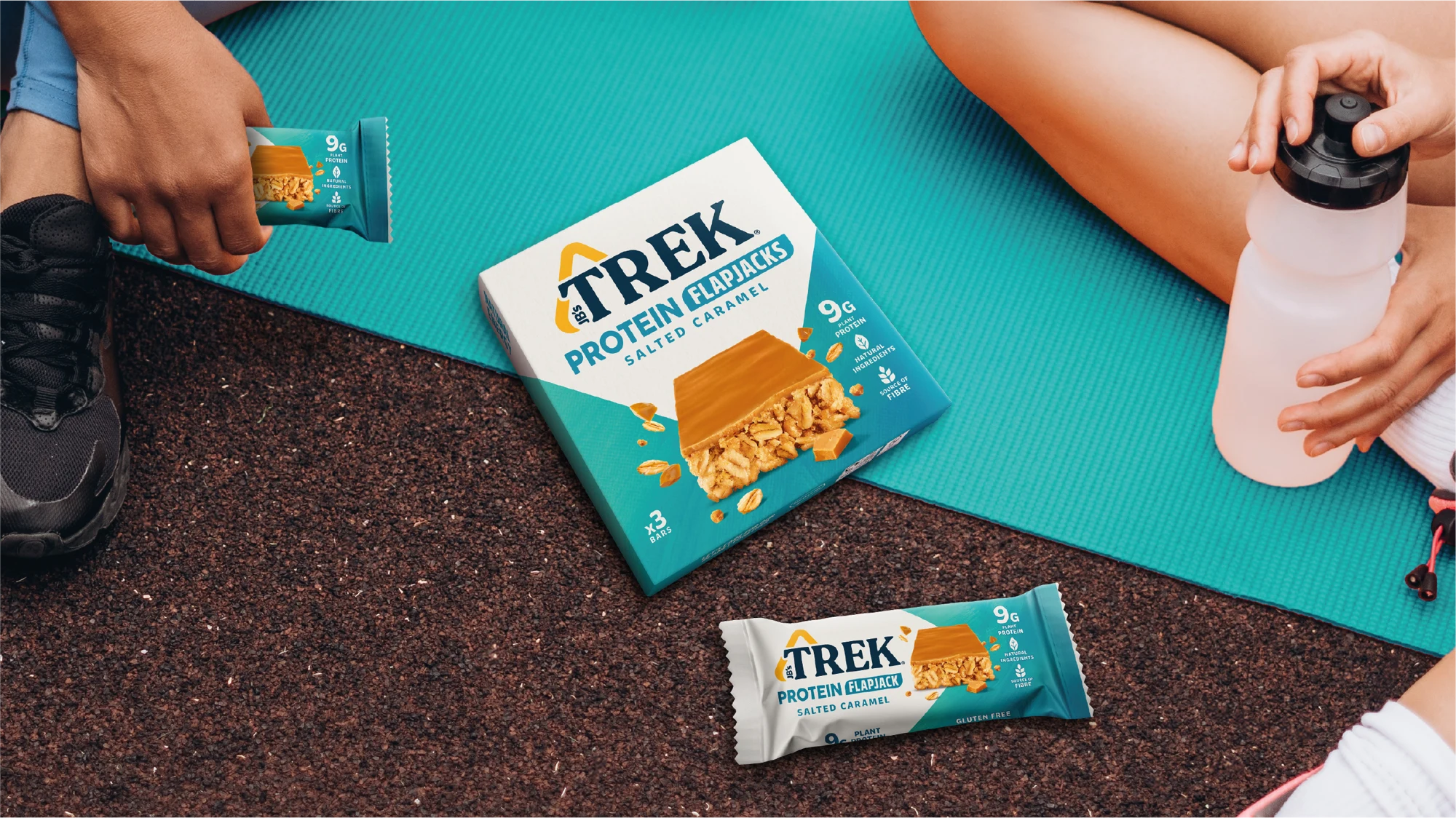
The world of fitness has become more accessible and integrated with everyday lifestyles. To be an approachable brand catering for everyone, TREK needed to reflect this cultural shift and move to a more vibrant, bold visual style to communicate a modern take on natural energy.

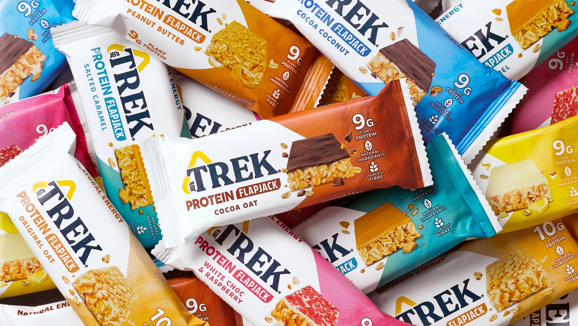
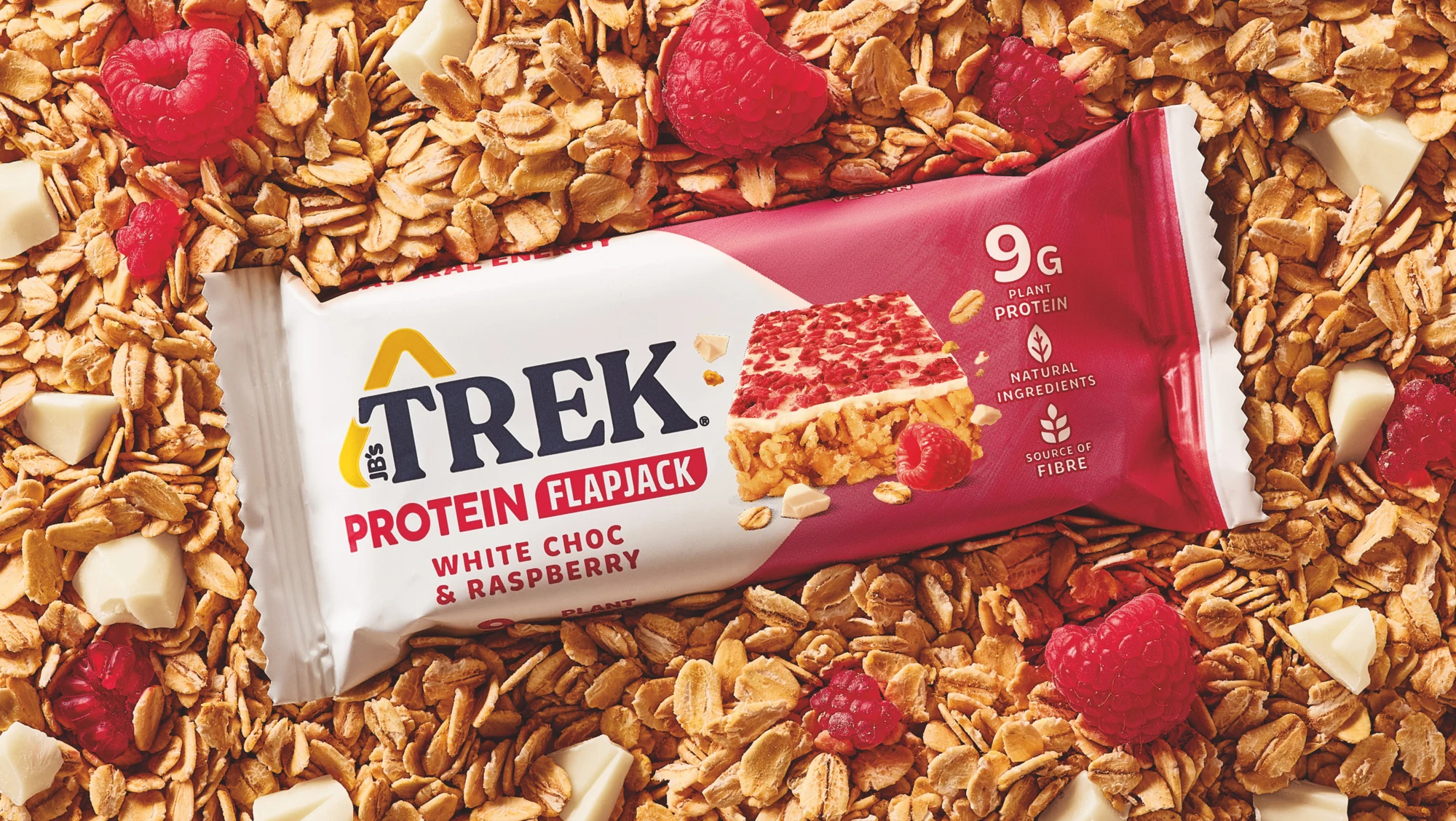
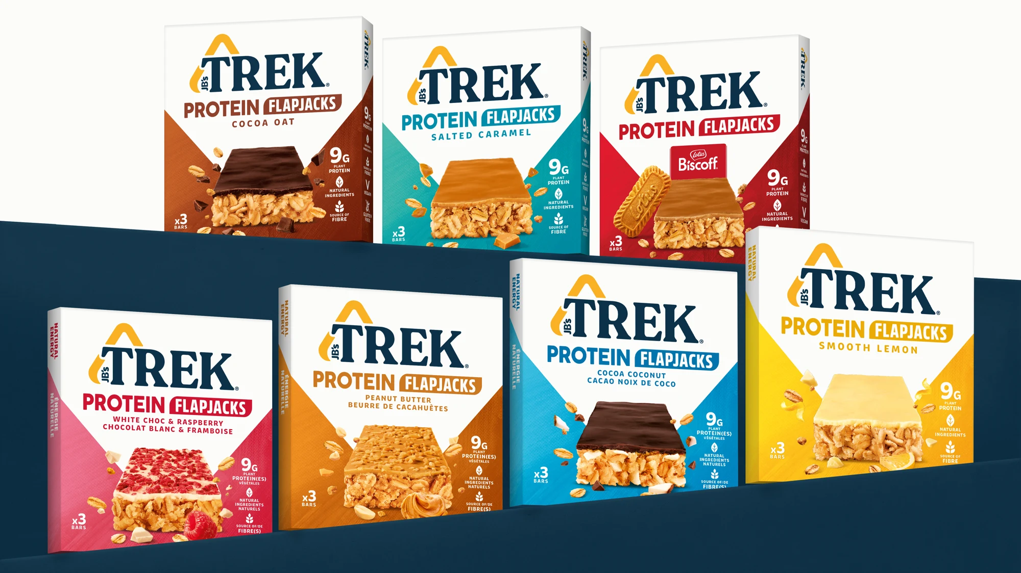
Approach.
We crafted a vibrant, taste-led design to bring fun, dynamism and accessibility to the TREK brand. We simplified the design, allowing us to hero the identity and chevron graphic — and optimise the communication hierarchy — to create an impactful and cohesive design solution with longevity. We developed a bright colour palette for variant navigation and featured an iconic visual of the bar to drive taste. TREK’s new look brings out the bar’s health benefits while staying deliciously bold and accessible on shelf.