A living identity for a living ecosystem.
Serra Da Estrela
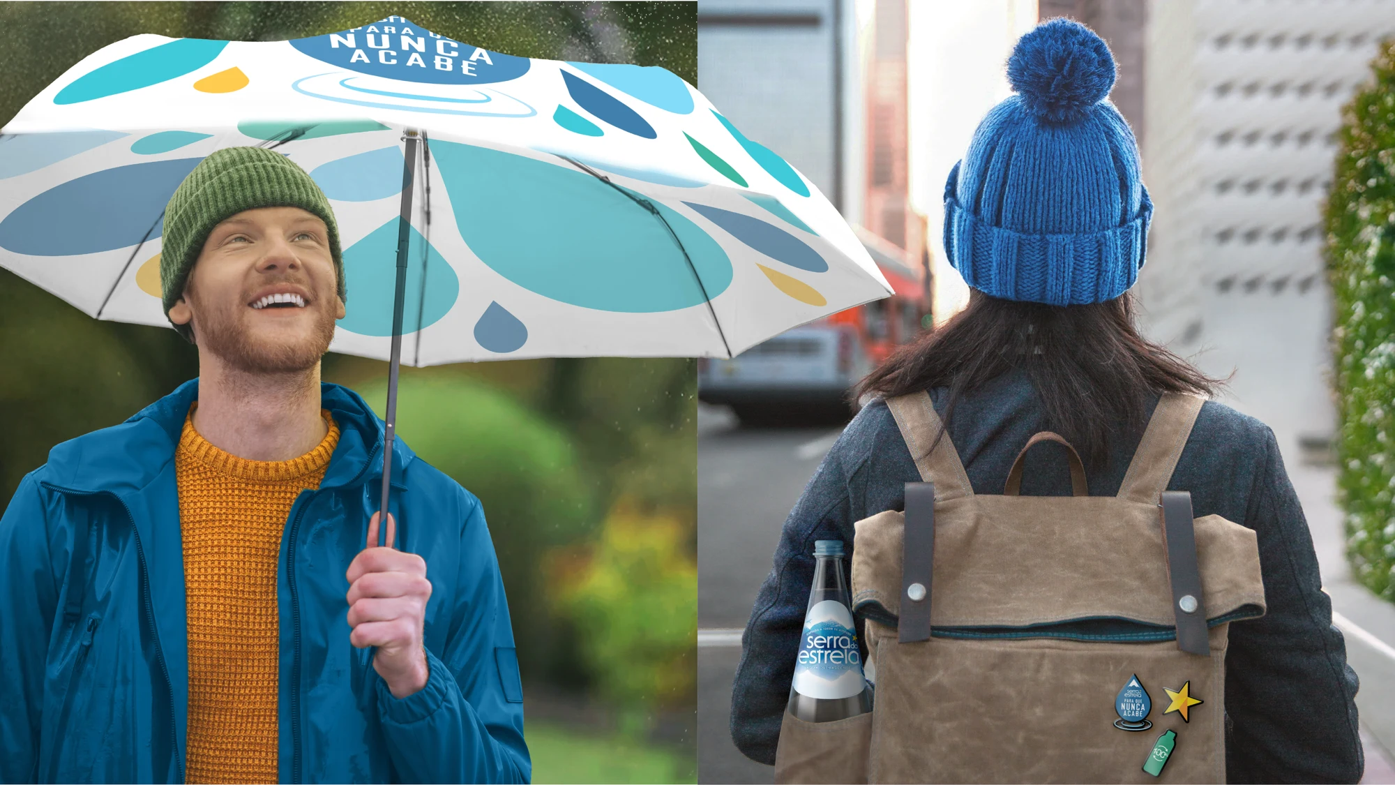
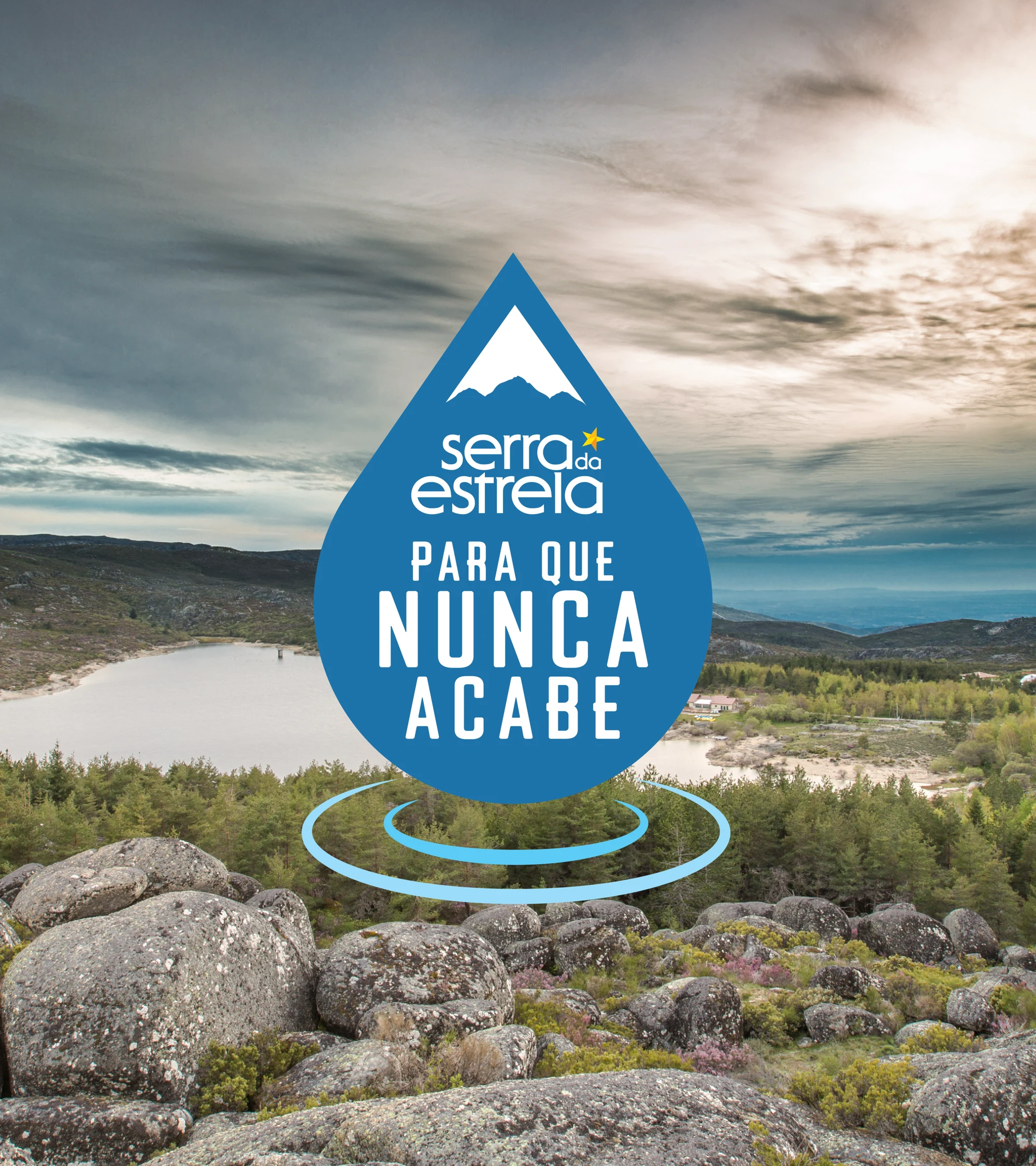
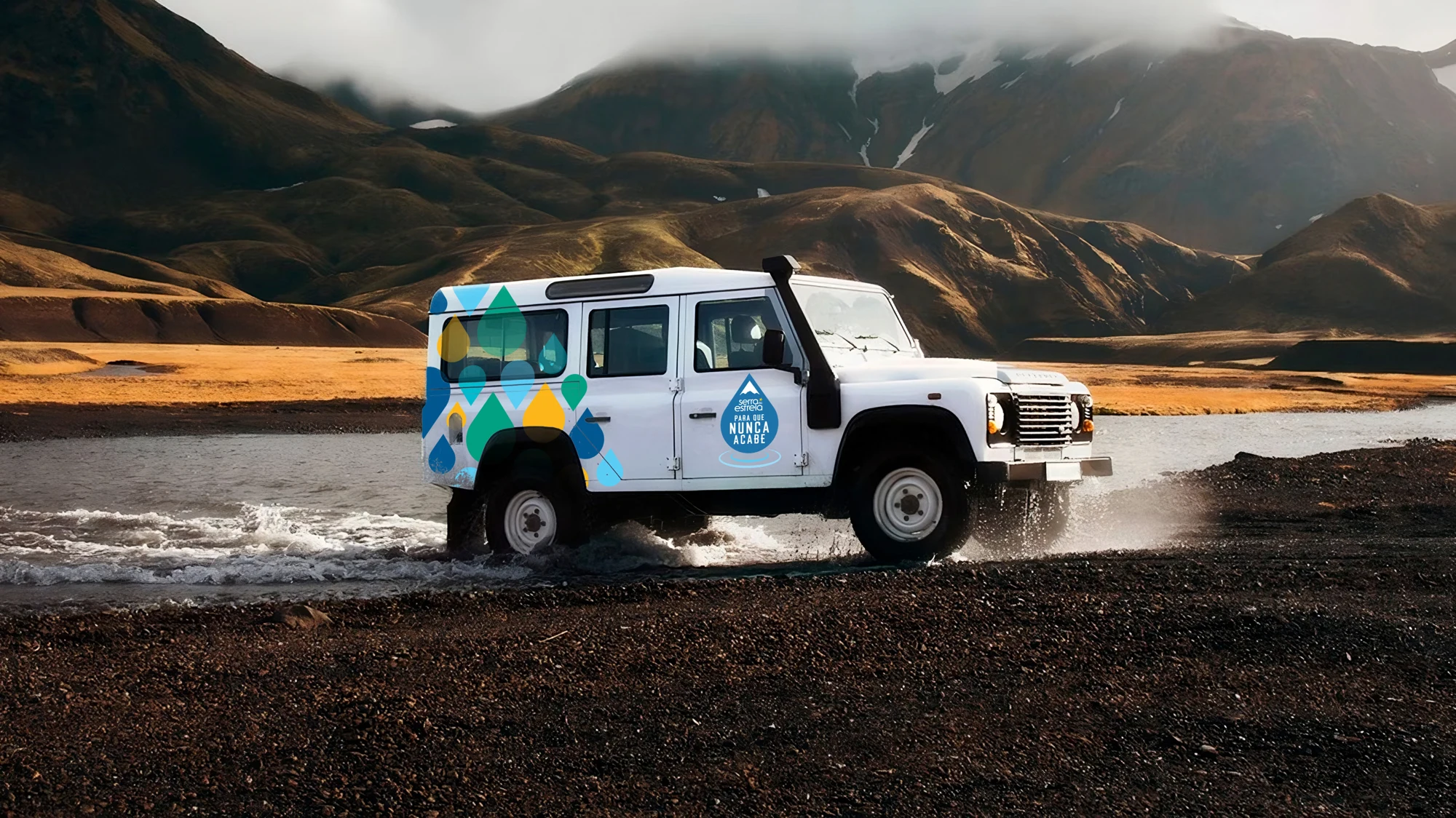
Originating from the highest spring in Portugal, at an elevation of 1,200 metres, Água Serra da Estrela is naturally filtered through the granite rocks of the Serra da Estrela mountain range. Committed to protecting its source and reducing its environmental impact, we partnered with Sumol Compal to build a communication device for the Para Que Nunca Acabe (So It Never Ends) sustainability movement — a visual identity that could function as both a recognisable stand-alone icon and an integrated element within Água Serra da Estrela’s packaging. The mission: express long-term environmental commitment through design clarity, brand flexibility, and emotional storytelling — all while staying true to the brand’s heritage and to help ensure the purest water has a sustainable future.
Brand refresh
Sustainability messaging
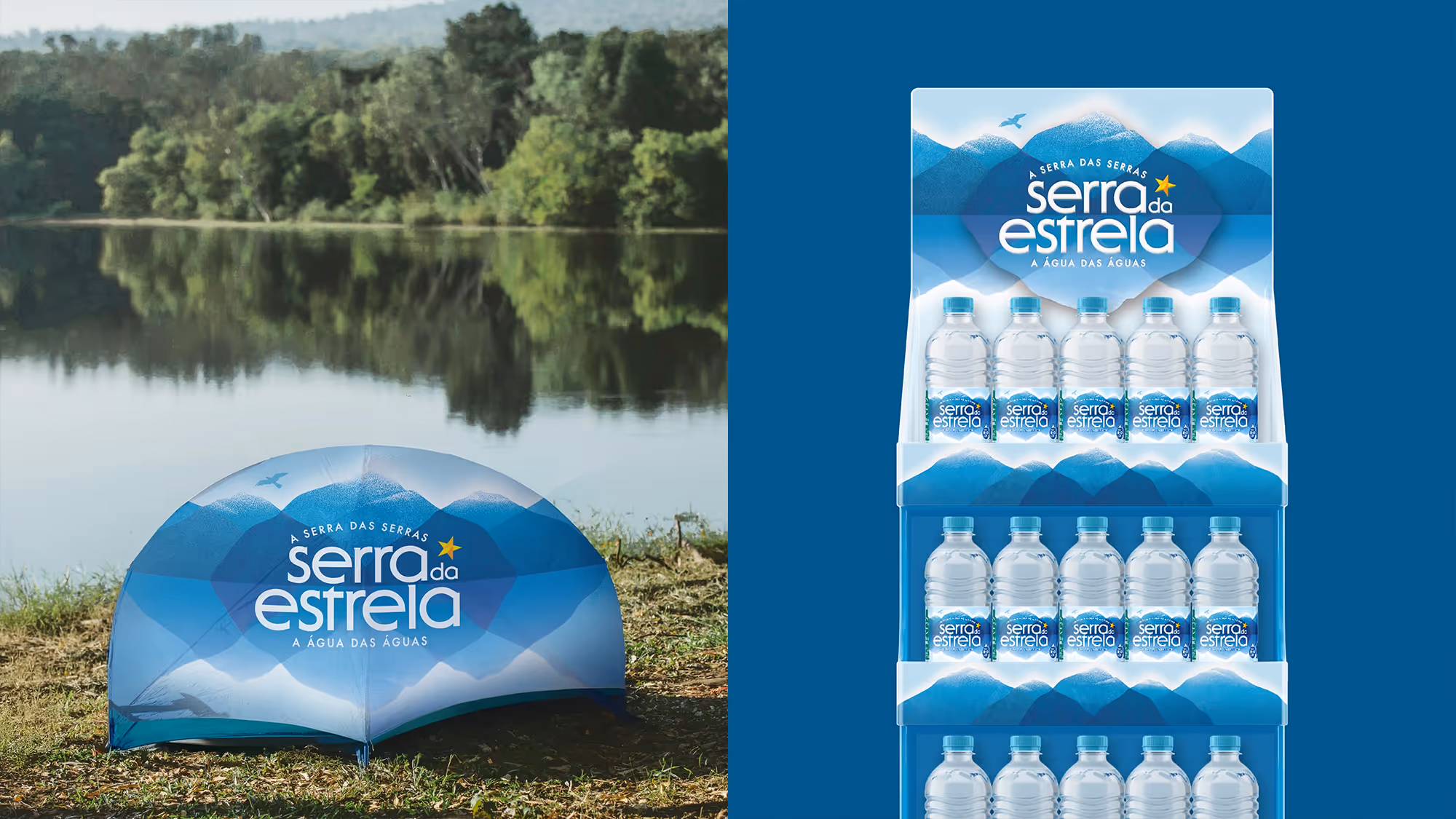
Packaging
Key visuals
Brand book
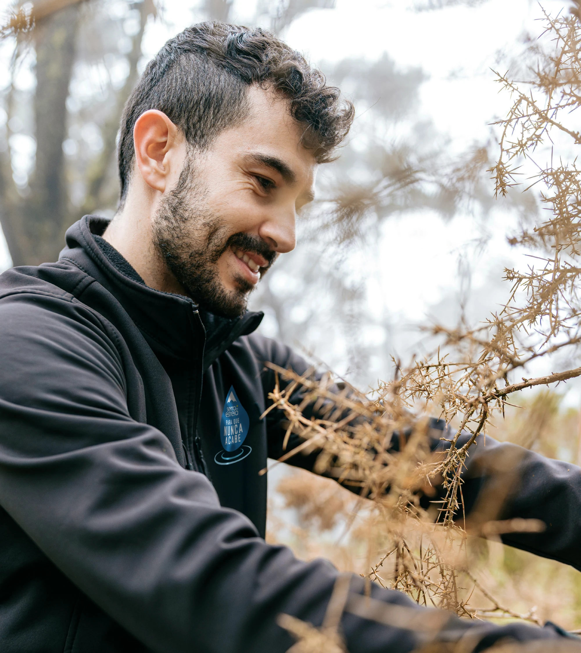
This brief required us to help express something larger than just a rebrand, it was about shaping a movement. It was designed to feel like a natural evolution of the brand, whilst giving Água Serra da Estrela the space to grow its environmental message over time to tie seamlessly into its provenance and brand story.
Adam Wilford
Creative Director, BrandMe
Insight.
A sustainability leader in its category.
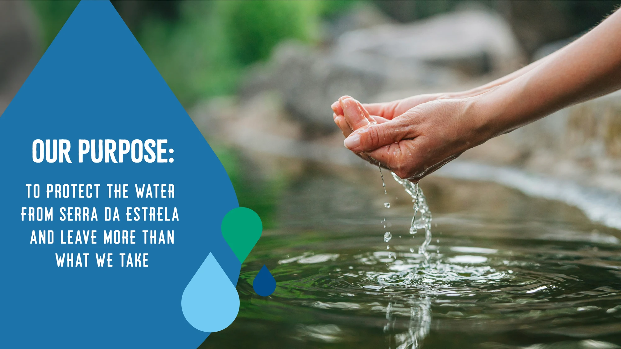
Water is life — and Água Serra da Estrela isn’t just a product. It’s an integral part of a vibrant ecosystem. When that ecosystem suffers, so does everything connected to it.
This campaign needed to reflect a deep, genuine commitment — one that would never end. The result is a brand and movement that reflects the land it protects — and invites every consumer to be part of the legacy.
This campaign needed to reflect a deep, genuine commitment — one that would never end. The result is a brand and movement that reflects the land it protects — and invites every consumer to be part of the legacy.
Approach.
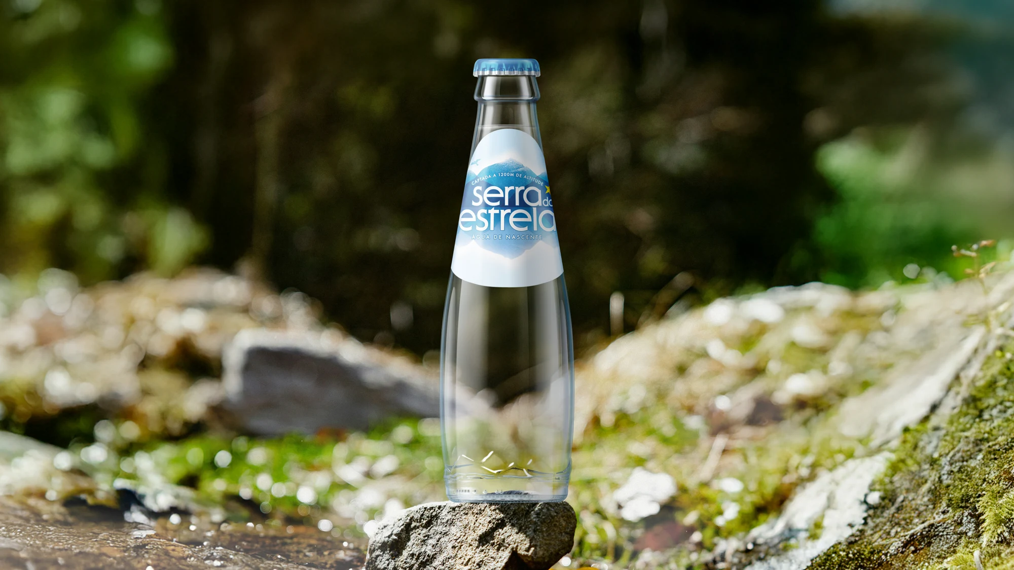
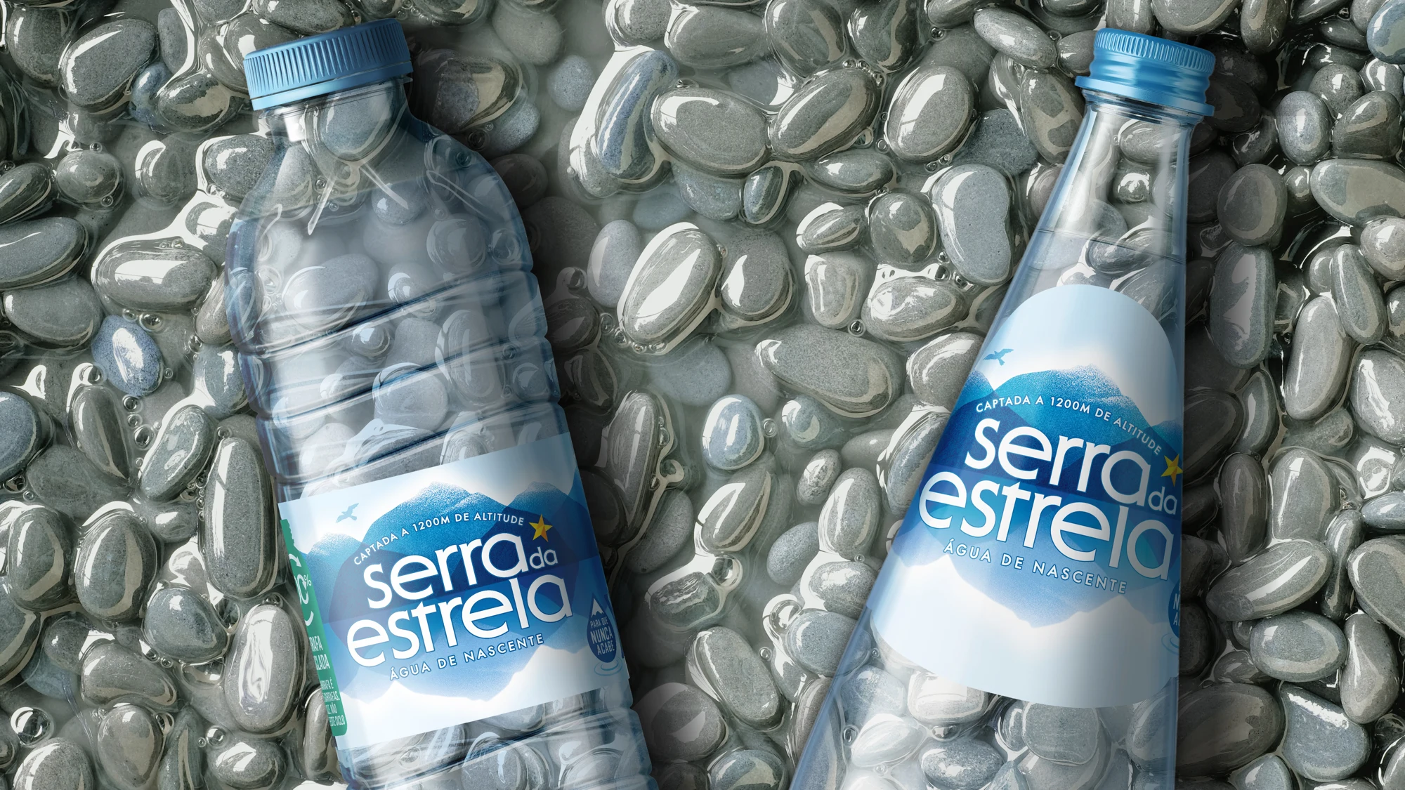
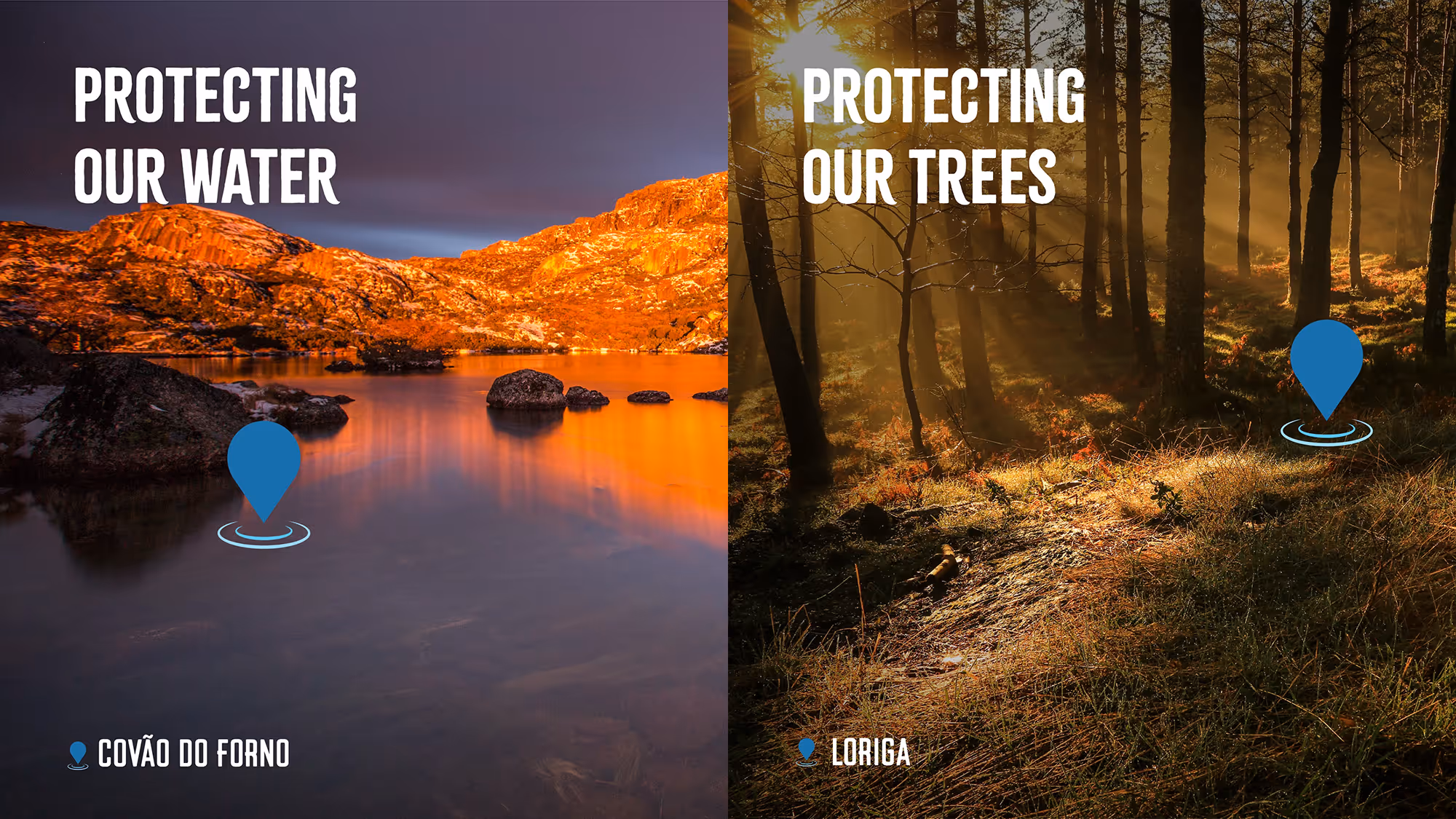
Whilst the recognisable brand identity remains the same, the mountain landscape and reflection have been simplified to celebrate the purity and clarity of the product, allowing for more brand flexibility and space to communicate other key brand messaging. The iconic crisp and snowy landscape is highlighted through the peaks of the mountain and fresh glow around it, with the addition of a bird representing the rich natural region from where it is sourced.

Realisation.
To ensure brand consistency across the new movement’s communication, we created a comprehensive set of brand guidelines to inform how the brand should behave and flex across the new set of assets.