A catalyst for life.
Maxx Power
In a world filled with challenges, conflict, and evolving narratives, there is an ever-growing desire for positive expression and a catalyst for change. Enter Maxx Power — a brand designed not just to energise, but to inspire. In the crowded energy drink markets of Armenia and Georgia, where most offerings blend into sameness, Maxx Power sets itself apart by encapsulating a spirit of dynamic adventure and self-expression.
We envisioned a brand that goes beyond a momentary energy boost, empowering consumers to seize every opportunity, from everyday moments to remarkable adventures. It’s not merely about staying energised — it’s about igniting creativity, encouraging bold expression, and uniting communities through a shared, vibrant spirit.
We envisioned a brand that goes beyond a momentary energy boost, empowering consumers to seize every opportunity, from everyday moments to remarkable adventures. It’s not merely about staying energised — it’s about igniting creativity, encouraging bold expression, and uniting communities through a shared, vibrant spirit.
Brand redesign
Brand positioning
Brand statement
TOV
Packaging
Packaging guidelines
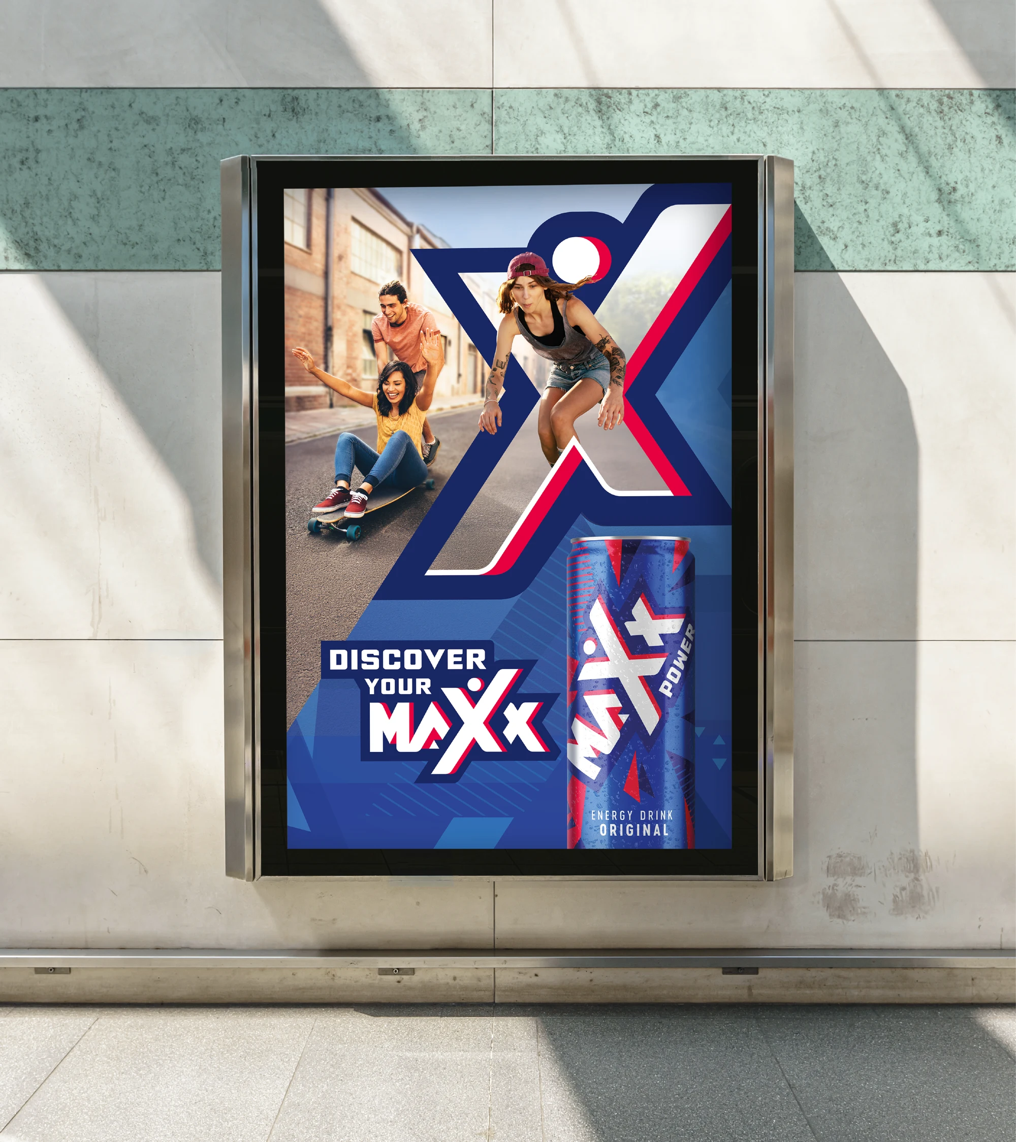
Key visuals
Motion
Maxx Power is positioned as a catalyst for life — a brand that energises, empowers, and inspires people to unlock their full potential through bold choices and meaningful, shared experiences. This project beautifully captures that spirit: the thrill of living dynamically, connecting deeply, and embracing every moment with purpose. It reflects what Maxx Power truly stands for — not just energy, but intentional, inspiring momentum. We’re proud to see our story come to life through such a powerful and creative lens. Special thanks to the BrandMe team for capturing the essence of Maxx Power so brilliantly.
Nune Stepanyan
Marketing Director of JI Pepsi-Cola Bottler, Armenia

Insight.
Redefining energy.
Consumers in these markets demand brands that truly capture their dynamic lifestyles. They aren’t satisfied with a mere energy boost—they want a product that resonates with their optimistic, go-getter spirit and sparks creativity in every moment.
In a landscape crowded with similar energy drink options, there’s a clear call for something different: a vibrant, inclusive, and charismatic brand that isn’t afraid to take risks and break away from the ordinary.
In a landscape crowded with similar energy drink options, there’s a clear call for something different: a vibrant, inclusive, and charismatic brand that isn’t afraid to take risks and break away from the ordinary.

Approach.
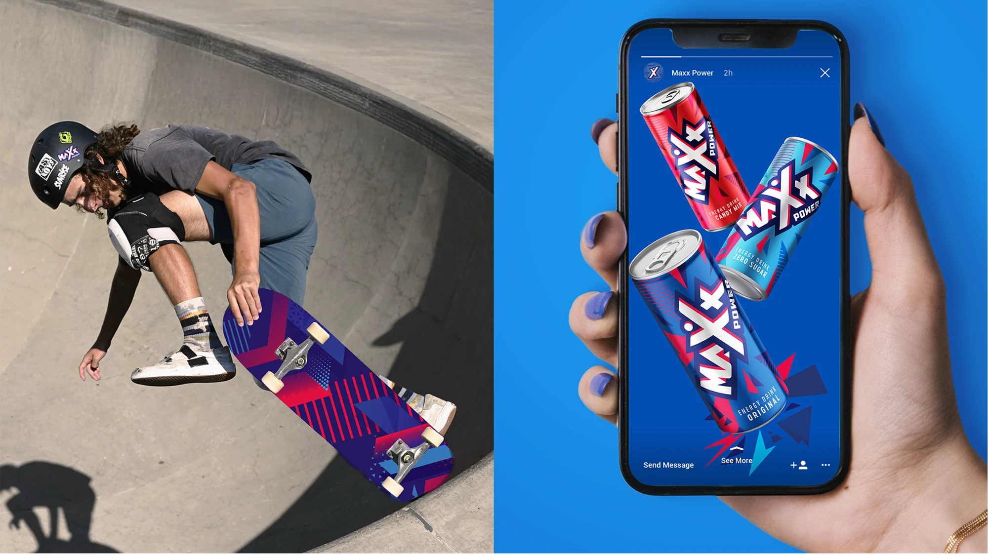
Our 360° strategy re-imagined every touchpoint of the brand—from its dynamic, energy-radiating logo to its engaging packaging and off-pack communications.
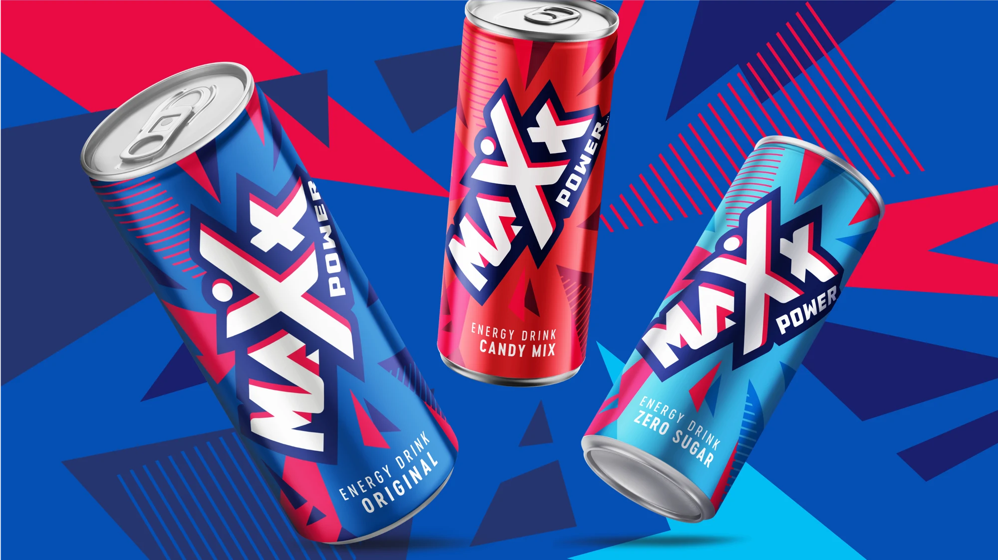
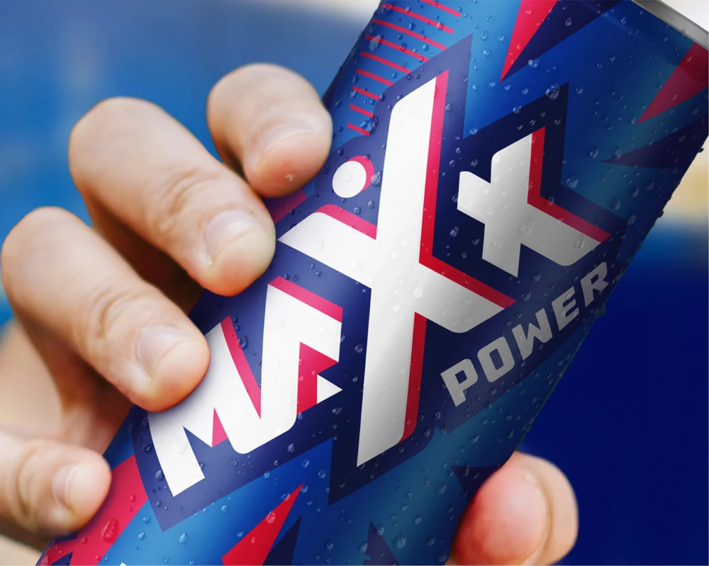
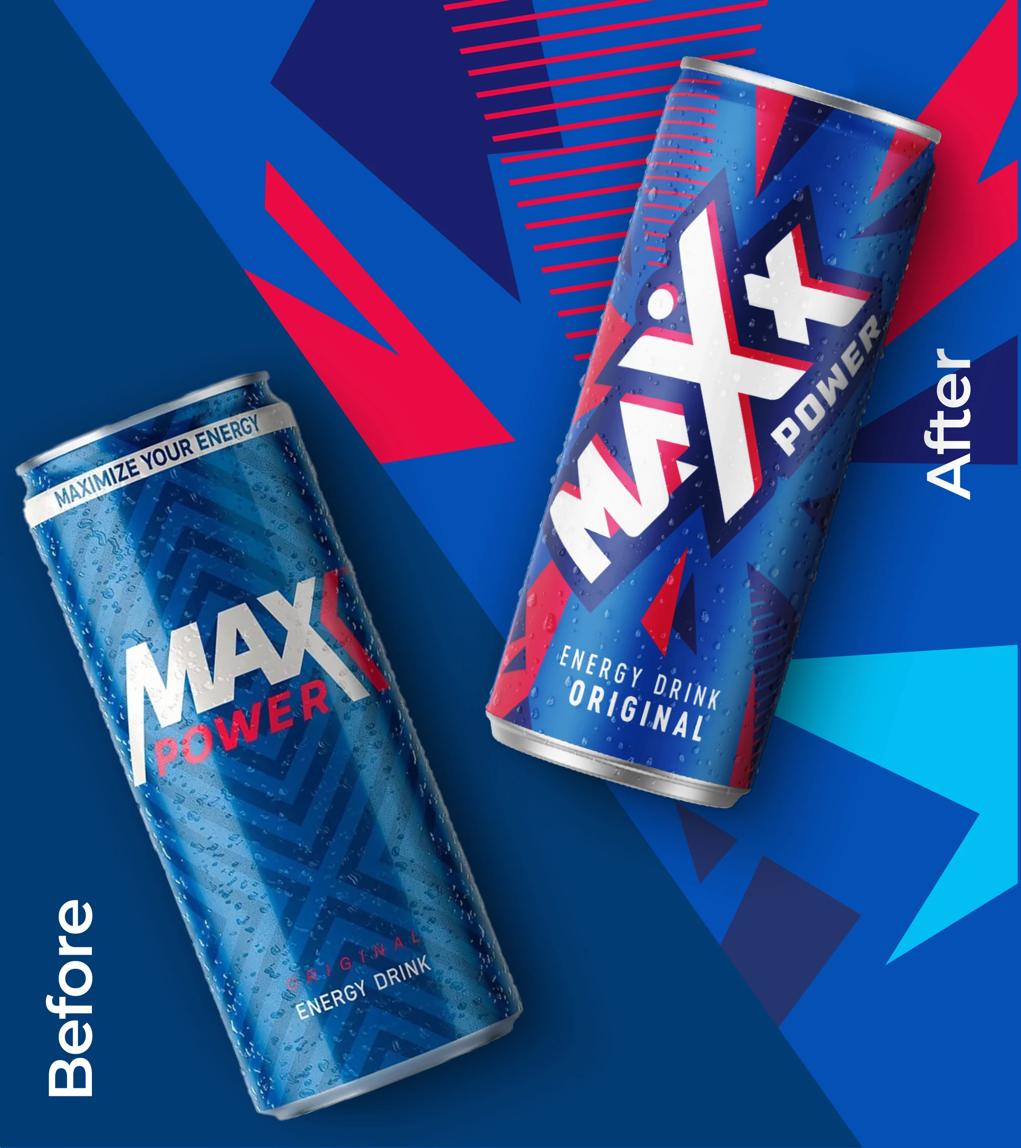
The new Maxx Power design captures the brand's raw energy through a distinctive, bold visual style. At its core is the master logo, symbolising the energetic and progressive personality of the brand. Crafted in the signature palette of dark blue, white and red accents, the logo is more than just an image—it’s the focal source of energy, with vibrant graphic elements radiating outward. The X icon, derived directly from the master logo, serves as a nimble shorthand for the brand’s positive energy. This dynamic mark humanises Maxx Power, offering a simplified yet powerful representation whenever the full logo isn’t required.
The new Maxx Power design captures the brand's raw energy through a distinctive, bold visual style. At its core is the master logo, symbolising the energetic and progressive personality of the brand. Crafted in the signature palette of dark blue, white and red accents, the logo is more than just an image—it’s the focal source of energy, with vibrant graphic elements radiating outward. The X icon, derived directly from the master logo, serves as a nimble shorthand for the brand’s positive energy. This dynamic mark humanises Maxx Power, offering a simplified yet powerful representation whenever the full logo isn’t required.