In harmony with nature.
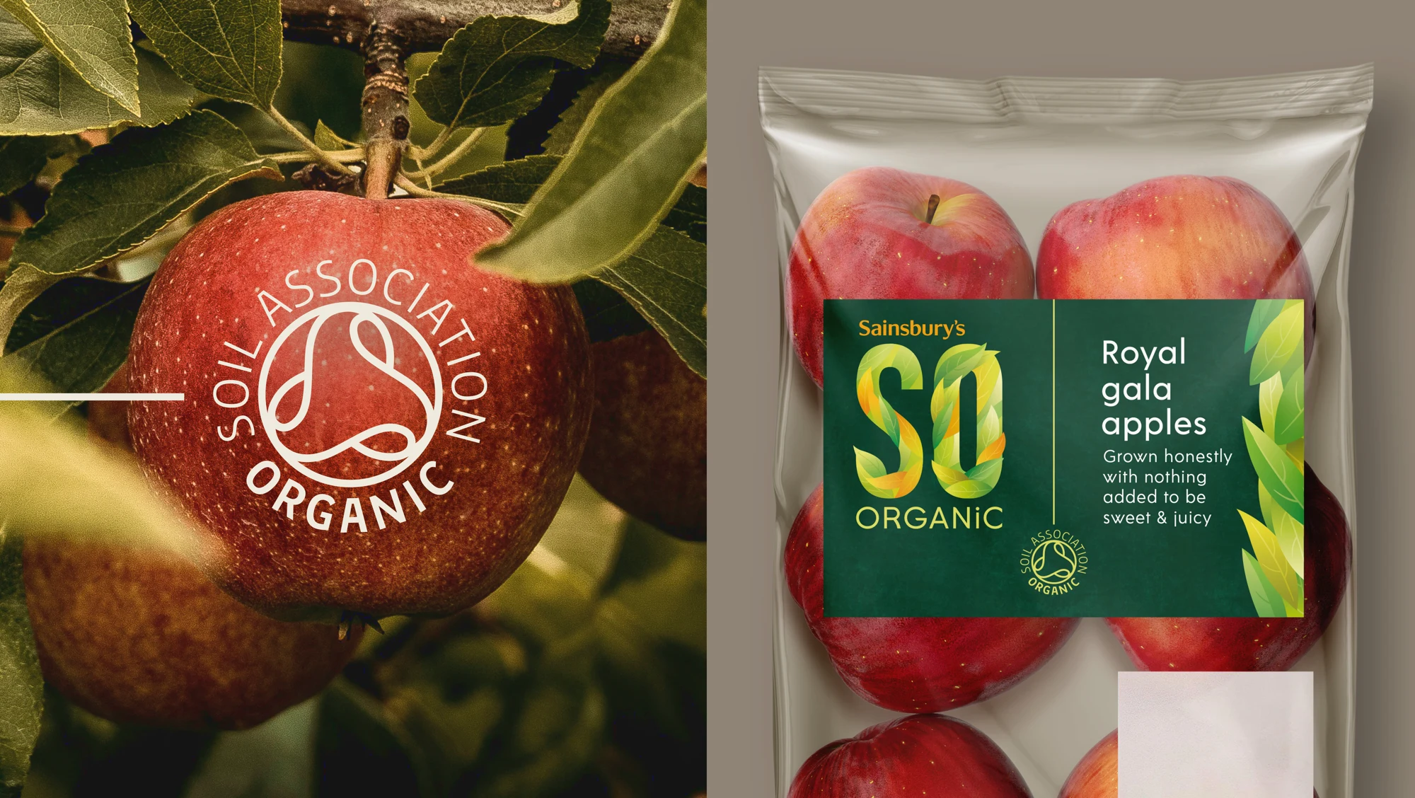
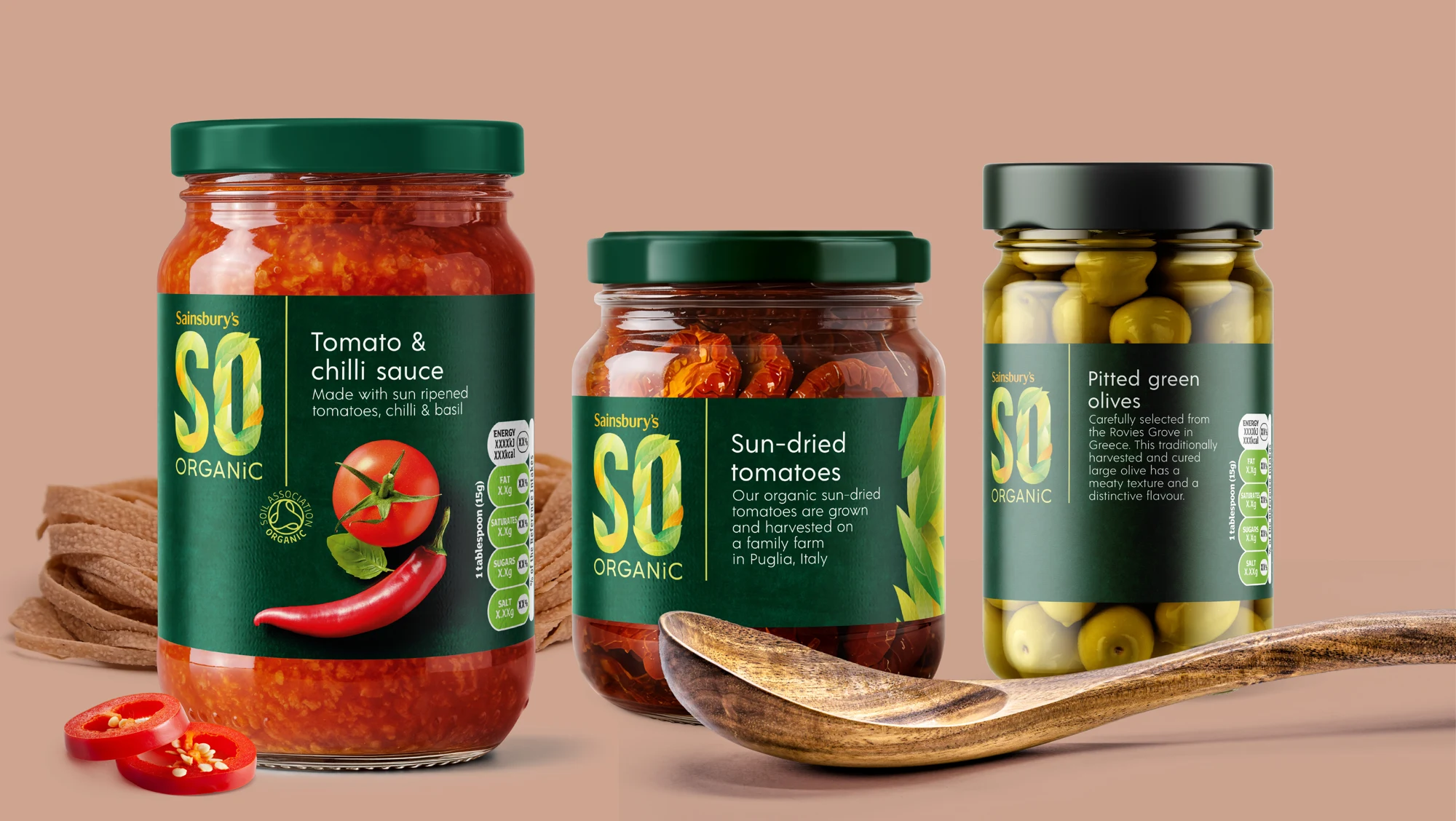
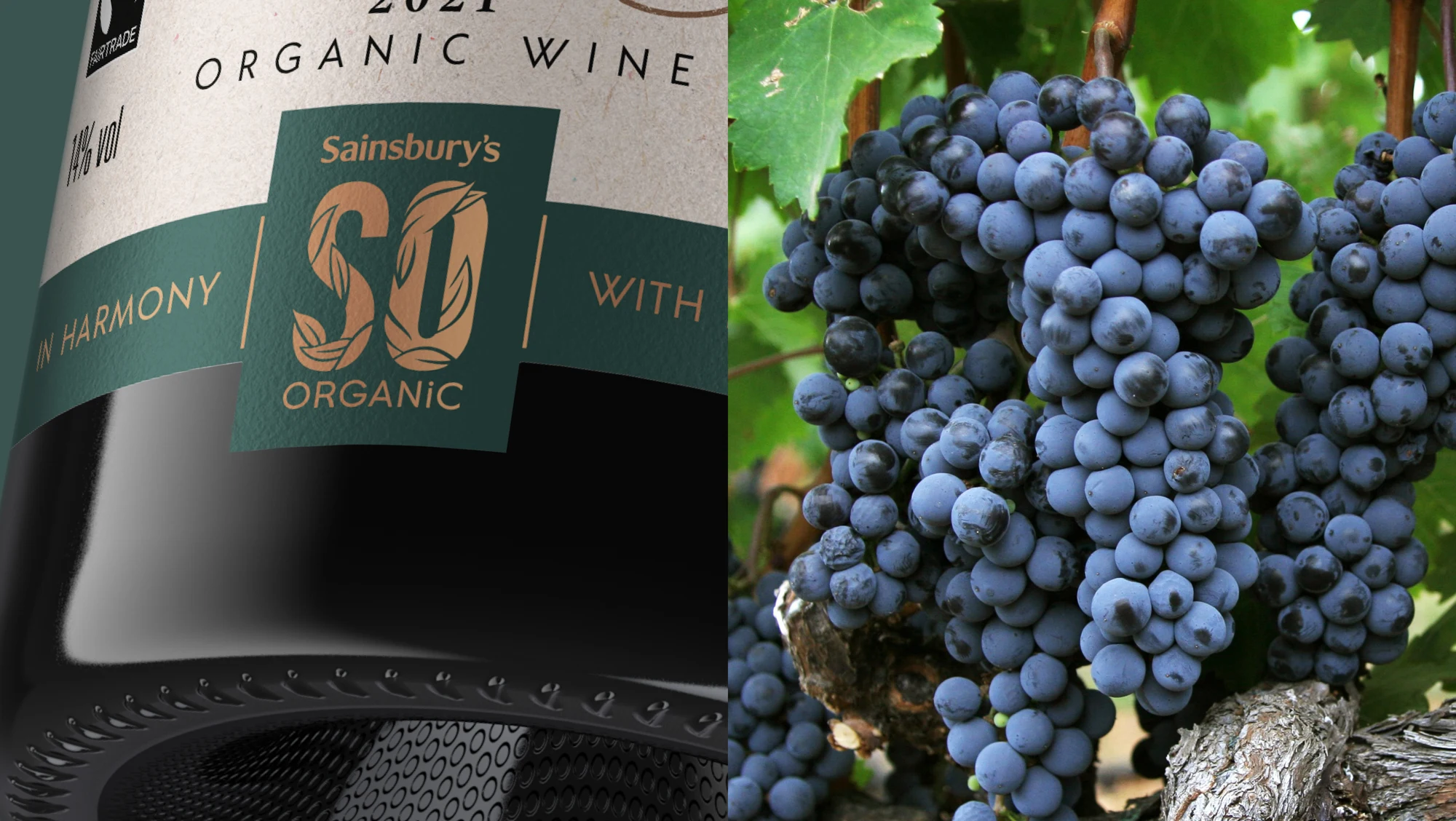
SO Organic
In a world where developing food trends are driving personality, character and warmth, the organic food category has faced increasing competition to stay appealing and relevant to consumers.
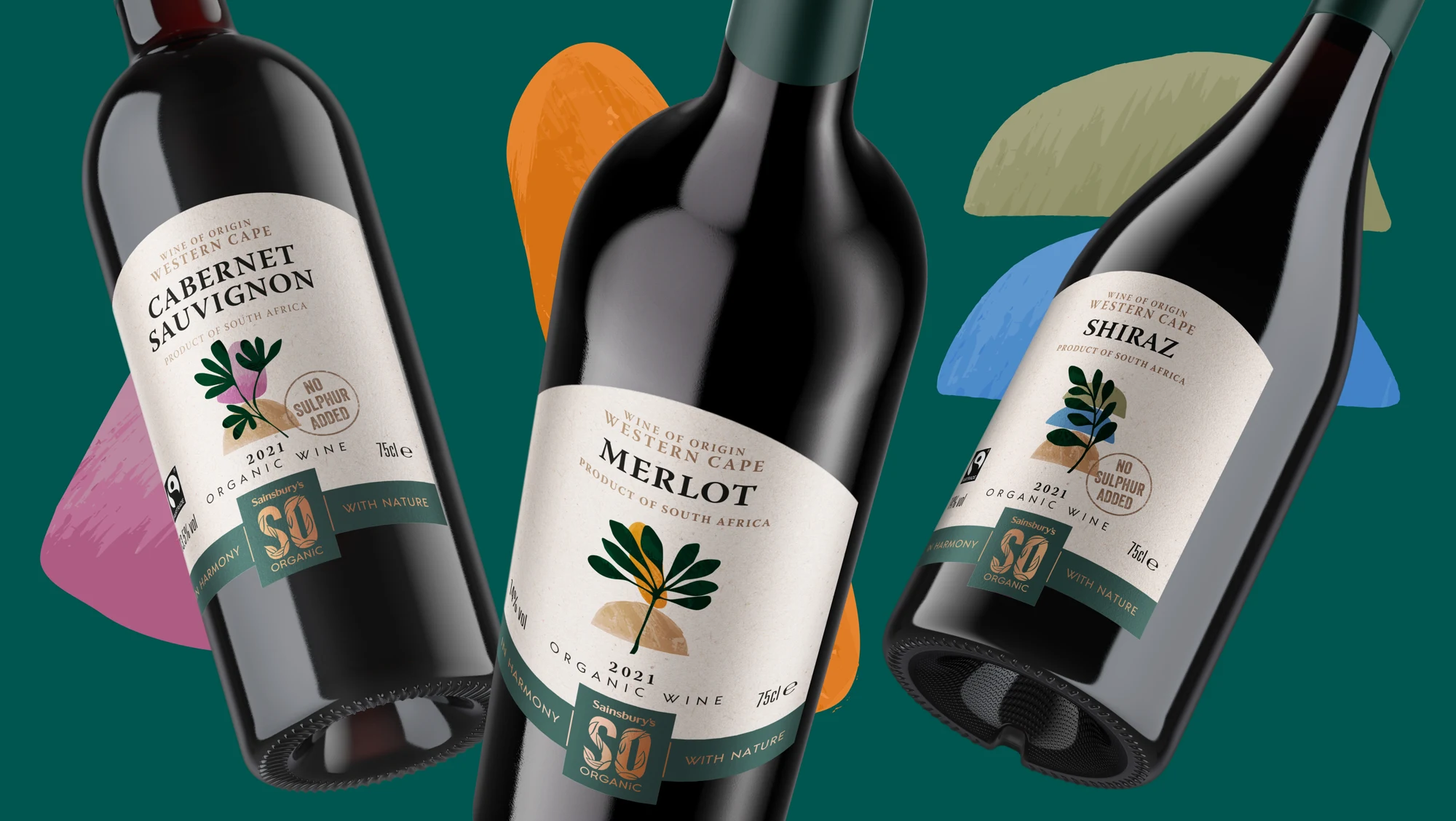
Originally introduced in the early 2000s, the Sainsbury’s SO Organic brand had been left behind in recent years and needed a new, bold and enticing look with a strong tone of voice to stand out from the crowd.
Originally introduced in the early 2000s, the Sainsbury’s SO Organic brand had been left behind in recent years and needed a new, bold and enticing look with a strong tone of voice to stand out from the crowd.
Brand creation
Packaging design
Brand guidelines
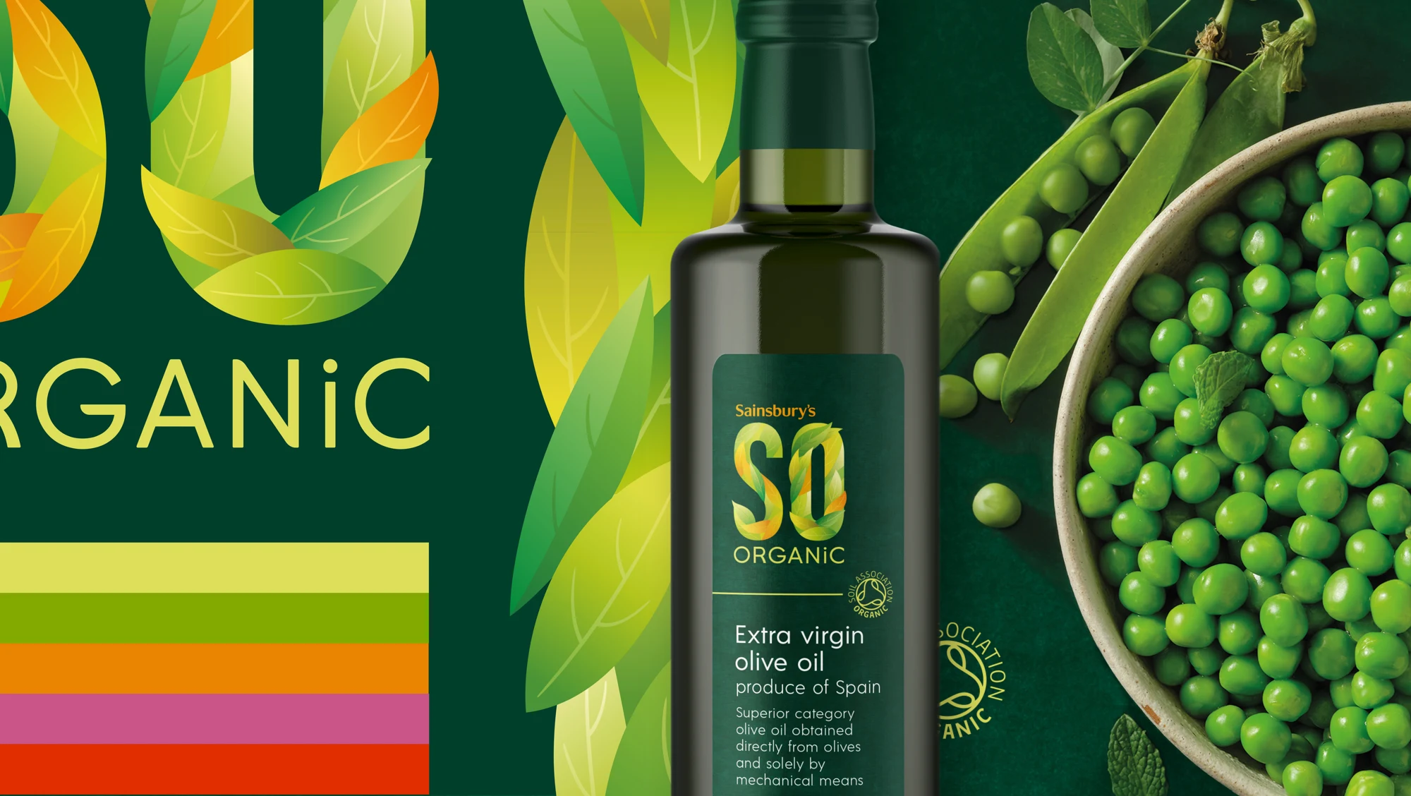
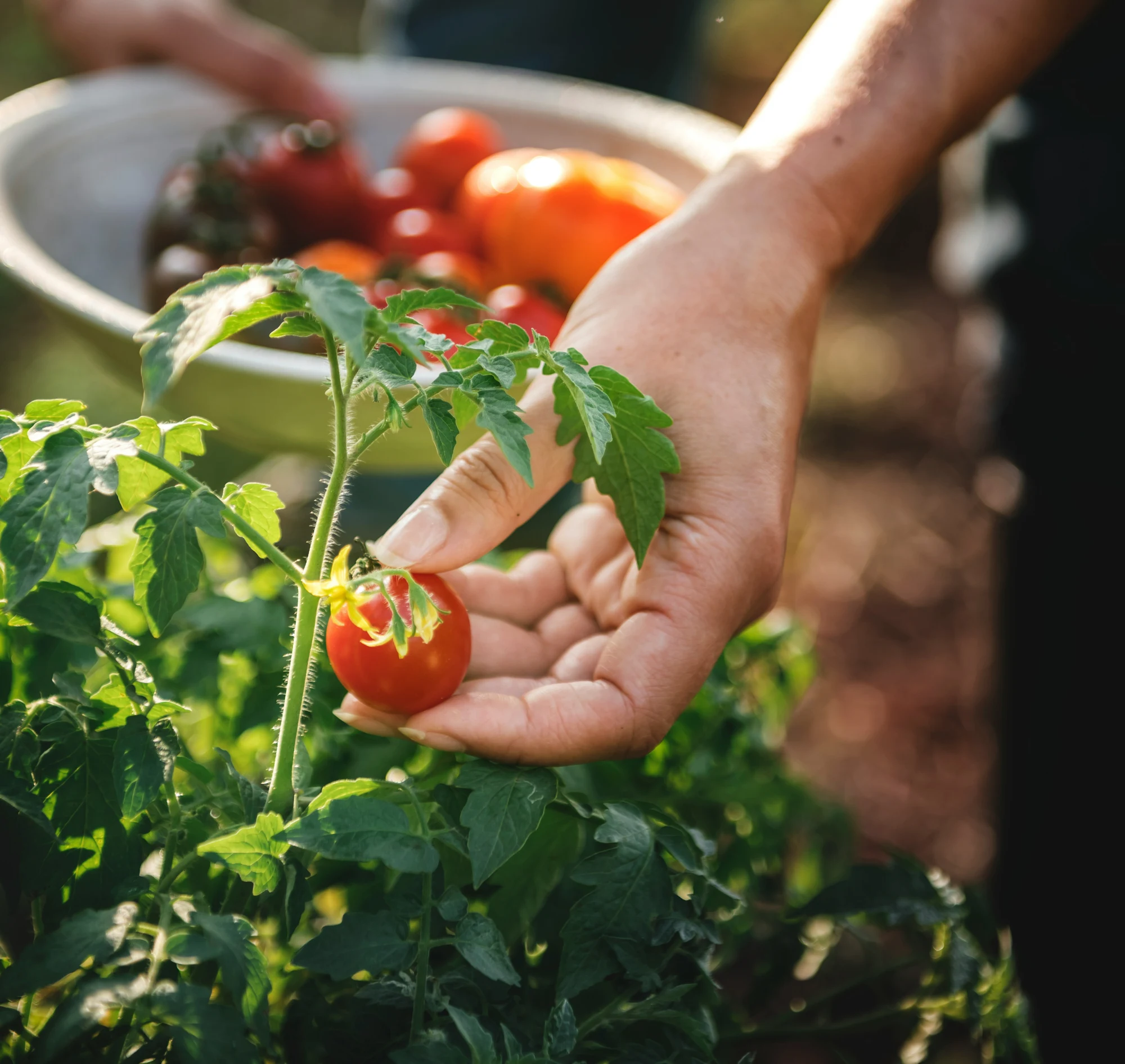
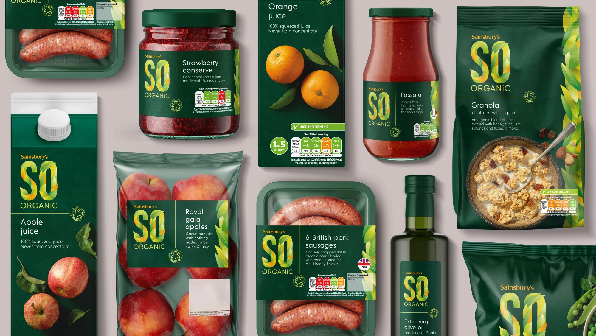
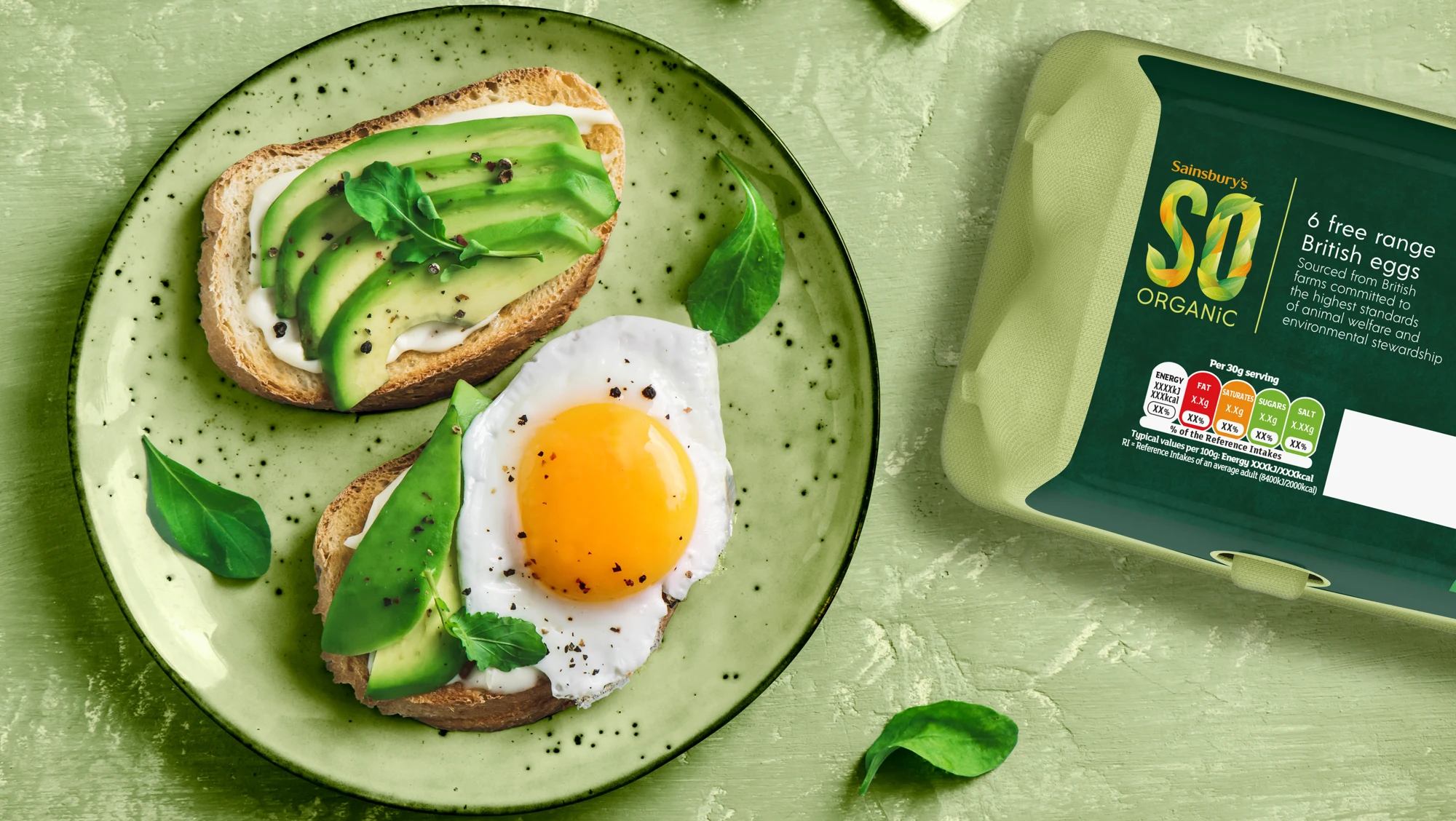
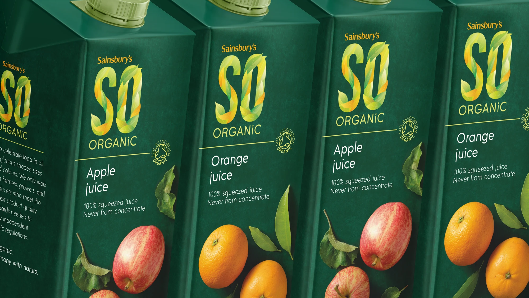
It became clear that what SO Organic needed was more warmth and emotion to hook consumers back into the category. We wanted the new brand mark to communicate the story of nature’s abundance and imperfectly honest products, to tap into the growing need to live in harmony with nature.
Coulter Patton
Creative Director, BrandMe
Approach.
Our new identity-led redesign focuses on building a more enticing brand experience, encouraging consumers to get back in touch with nature and celebrate the genuine imperfection of organic produce, all whilst reassuring them of the premium quality and expertise that the Sainsbury’s name brings to the range. The bold, cohesive design makes the range easy to locate and navigate across all categories in store.